
Stevens Pass Parking: From Policy Page to Trip Planning Experience
Role: Content Strategy · UX / Information Architecture · Web Content Design
Scope: Research · Content Strategy · Page Structure · UX Recommendations · CMS Implementation
Parking was becoming a major friction point in the Stevens Pass guest journey. The information guests needed existed, but it was difficult to find, difficult to understand, and often left guests unsure about what applied to their specific trip.
I led the research and content strategy for a new parking experience designed to answer a more useful question:
Instead of “What are the parking rules?” → “How should I plan my trip?”
Before
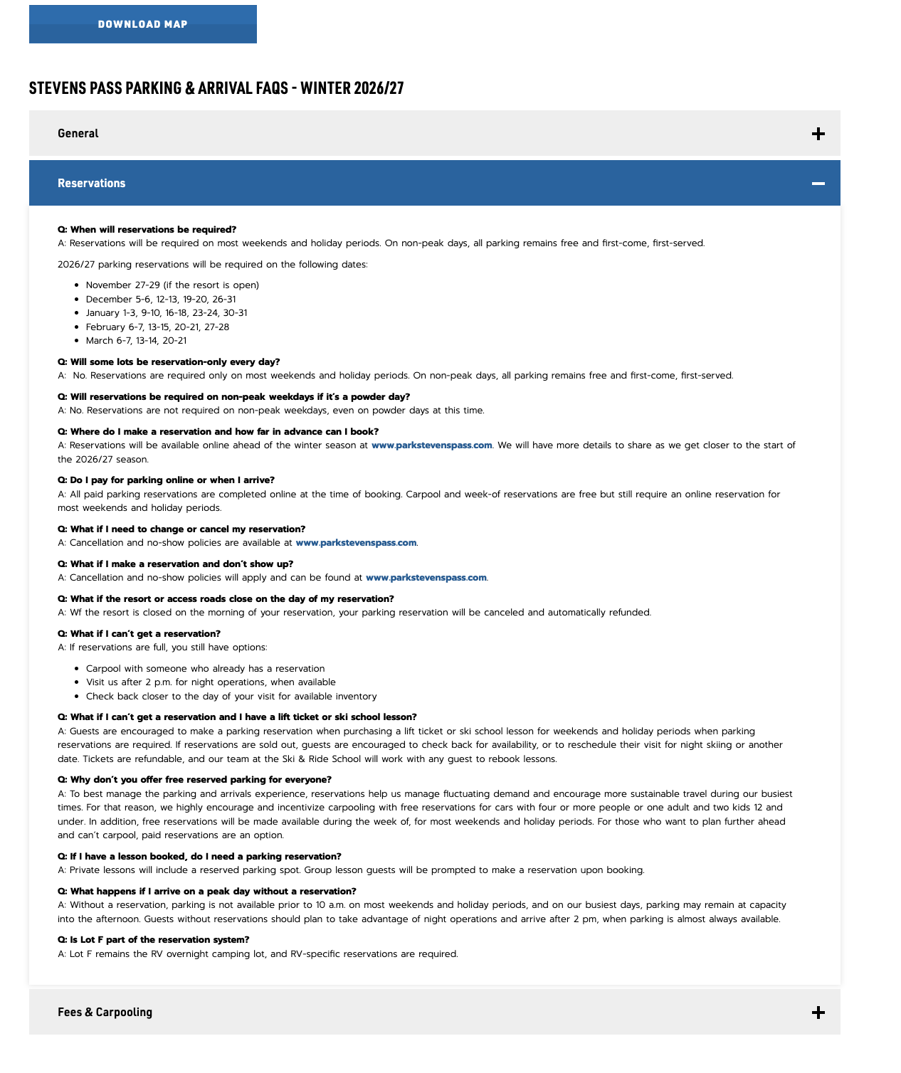
Key information was hard to find
Too much text
Unclear what applied to each guest
No obvious CTA
Phase 1 | MVP
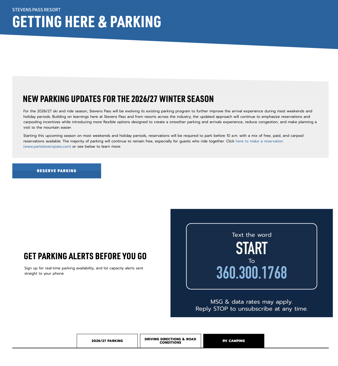
Prominent CTA
Clear sections for key questions
simpler layout
Quick access to key details
Phase 2
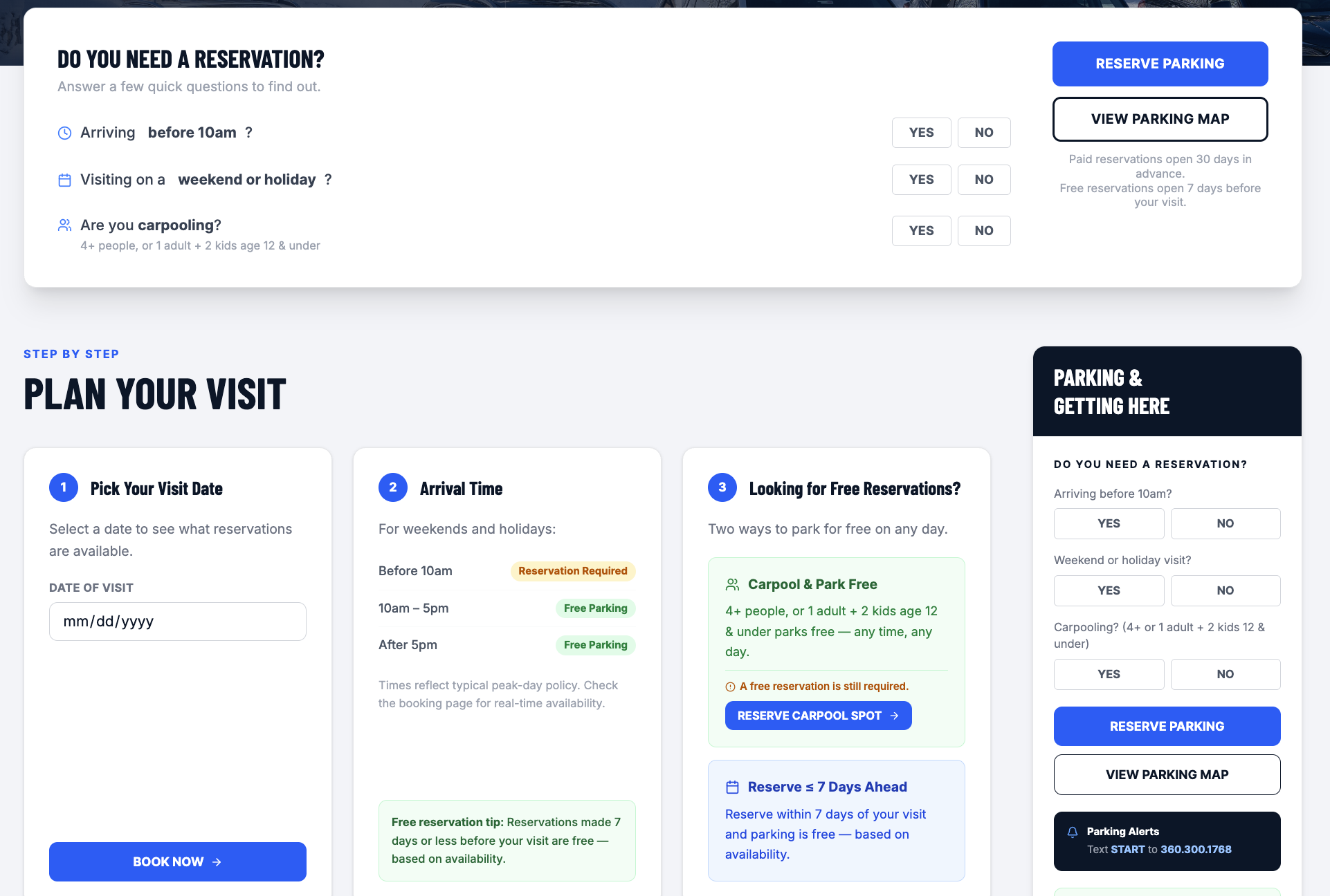
Interactive trip planner
personalized recommendations
scenario based
Less time required for guest to learn
The Problem
Parking questions were creating friction for both guests and employees. The information existed. The experience was difficult to navigate.
Guests needed answers to questions like:
Do I need a reservation?
When do I need one?
What time should I arrive?
What does parking cost?
Can I park for free?
What happens if reservations are sold out?
Where do I park?
What happens if conditions change?
The deeper issue was not a lack of information. It was findability, hierarchy, and personalization.
The Process
01 | Discover
Research | guest questions | industry patterns
I reviewed existing Stevens Pass content, gathered stakeholder and frontline feedback, identified recurring guest questions, and reviewed parking experiences across other ski resorts.
The research revealed three consistent opportunities:
1. Put the important information first
2. Replace text-heavy explanations with visual planning tools
3. Design around scenarios, not policies
02 — DEFINE
From information architecture to trip planning
The opportunity became clear:
Parking shouldn't function as a policy document. It should function as a trip-planning tool.
I translated the research into a proposed hierarchy centered around the actions guests actually needed to take:
Reserve → Understand → Plan → Arrive
The full recommendation proposed a personalized trip planner that could ask for visit date, vehicle occupancy, and arrival time, then return relevant reservation requirements, cost options, and arrival guidance.
03 — DESIGN & SHIP
From concept → CMS-ready experience
The ideal experience included interactive tools, but Stevens Pass's current CMS could not support all of the proposed functionality.
Rather than waiting for the perfect technical solution, I separated the work into an MVP and Phase 2.
The live page prioritizes the highest-value information that could be implemented now.
04 — PHASE 2
Make parking personalized
The next evolution would turn the page from a static guide into an interactive planning system.
Guests enter:
Visit date, Group size & Arrival time
The system returns:
Reservation requirement, Cost/free options, recommended arrival & Next action
THE TAKEAWAY
This project reinforced a principle I use in content design:
Sometimes the problem isn't that people need more information. They need the information to work harder for them.
By restructuring parking around guest decisions rather than resort policies, we created a clearer foundation for planning a visit today, while establishing a path toward a more personalized experience tomorrow.